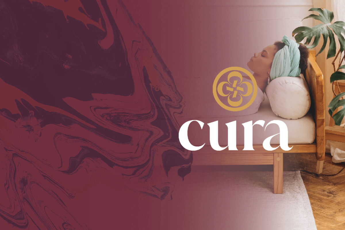

The narrative power of a well thought out brand identity can change public perception of previously stigmatized substances creating accessibility to the benefits. Here’s a little bit behind the Cura brand of psilocybin supplements.
Problem Identification
How does the stigma around drug culture affect the legitimization of psilocybin and how can this be reversed?
Mission Statement
Cura provides access to the benefits of psilocybin by cultivating an approachable product through dose consistency, education and guidance in usage.
Historical Context
The curandera tradition is one deeply rooted in ancient mexican culture. These well respected healers often treat mental & spiritual ailments using remedies passed down from Aztec culture utilizing the psychoactive effects of psilocybin in certain types of mushrooms found throughout Mexico, Central and South America.
Research, Theory + Critical Study
The War on Drugs creates a mythology around certain substances and the people that use them by placing stigmas in order to marginalize certain groups. In the case of psilocybin mushrooms and other psychadelics, the stigmatization was a direct result from the counter-culture movement in the 1960’s.
Jessica M. Bracco, The United States Print Media and its War on Psychedelic Research in the 1960s
Currently, psilocybin is a schedule 1 drug: no currently accepted medical use and high potential for abuse.
The stigma does not lie in the stigmatized attribute or the stigmatizing audience but rather the relationship between the audience and attribute.
Erving Goffman’s work on stigma
This stigma perpetuates a mythology that psychadelics drugs are as dangerous as other drugs like heroin or meth.
Roland Barthes’ work on semiotics and myth creation.
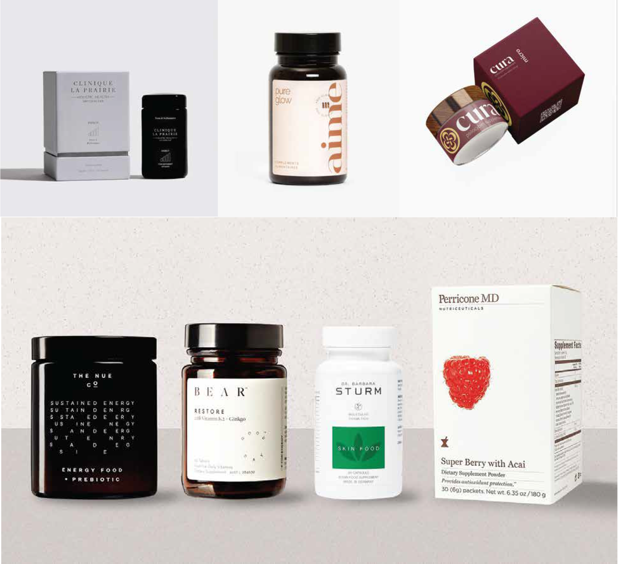
Cannabis Industry as a Model
Since the legalization in cannabis, consumption has become more and more widely accepted. Part of this is due to brands getting away from the stereotypical stoner culture that has been a big part of the negative stigma around the drug.
The last couple of years the industry has seen an increase in consumption from new dempgraphics (those not previously cannabis users). This is due impart to increased education and new products that are familiar to the consumer like gummies, capsules and tablets that provide a more consistent dosing.
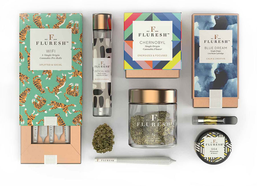
example of cannabis packaging from fluresh.com
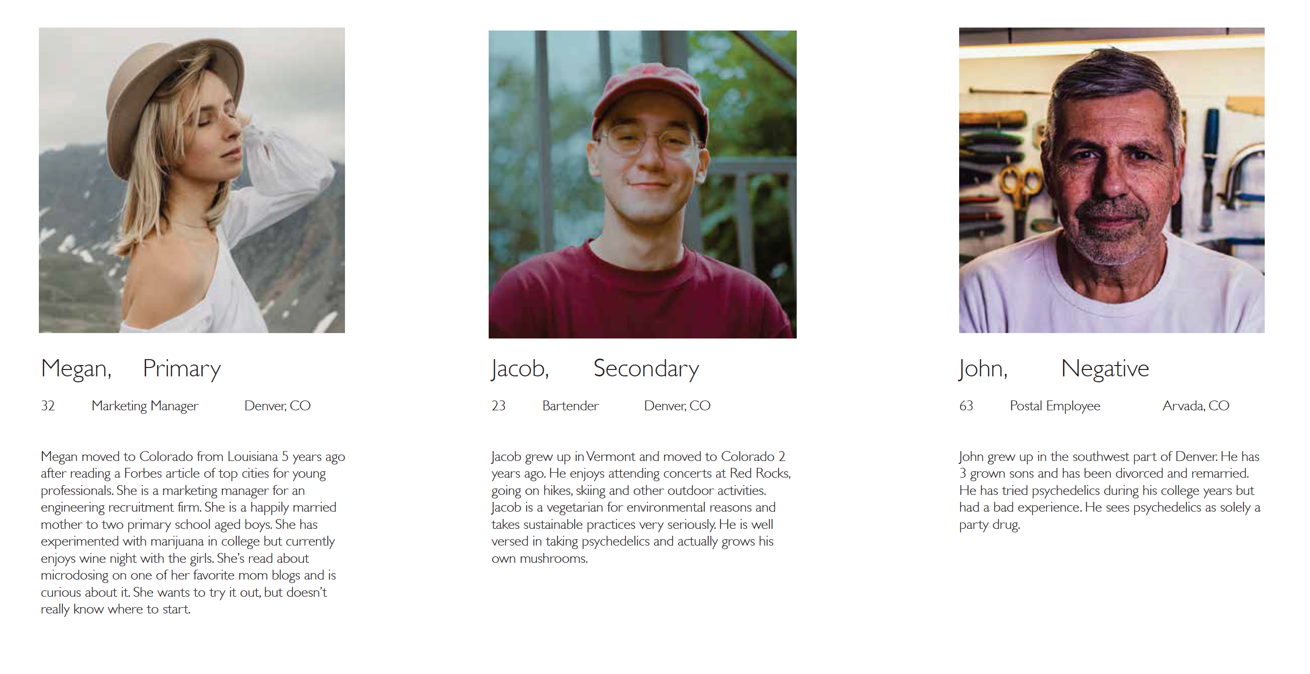
User Personas
Identity
Icon
A modernized interpretation of ancient Meso-American mushroom imagery.
Typography
Juana is a typeface that is distinctly Latin- American in it’s proportions and serif design, yet lends a sort of modernity with it’s high contrast in stroke weight.
Juana Semibold from Latinotype
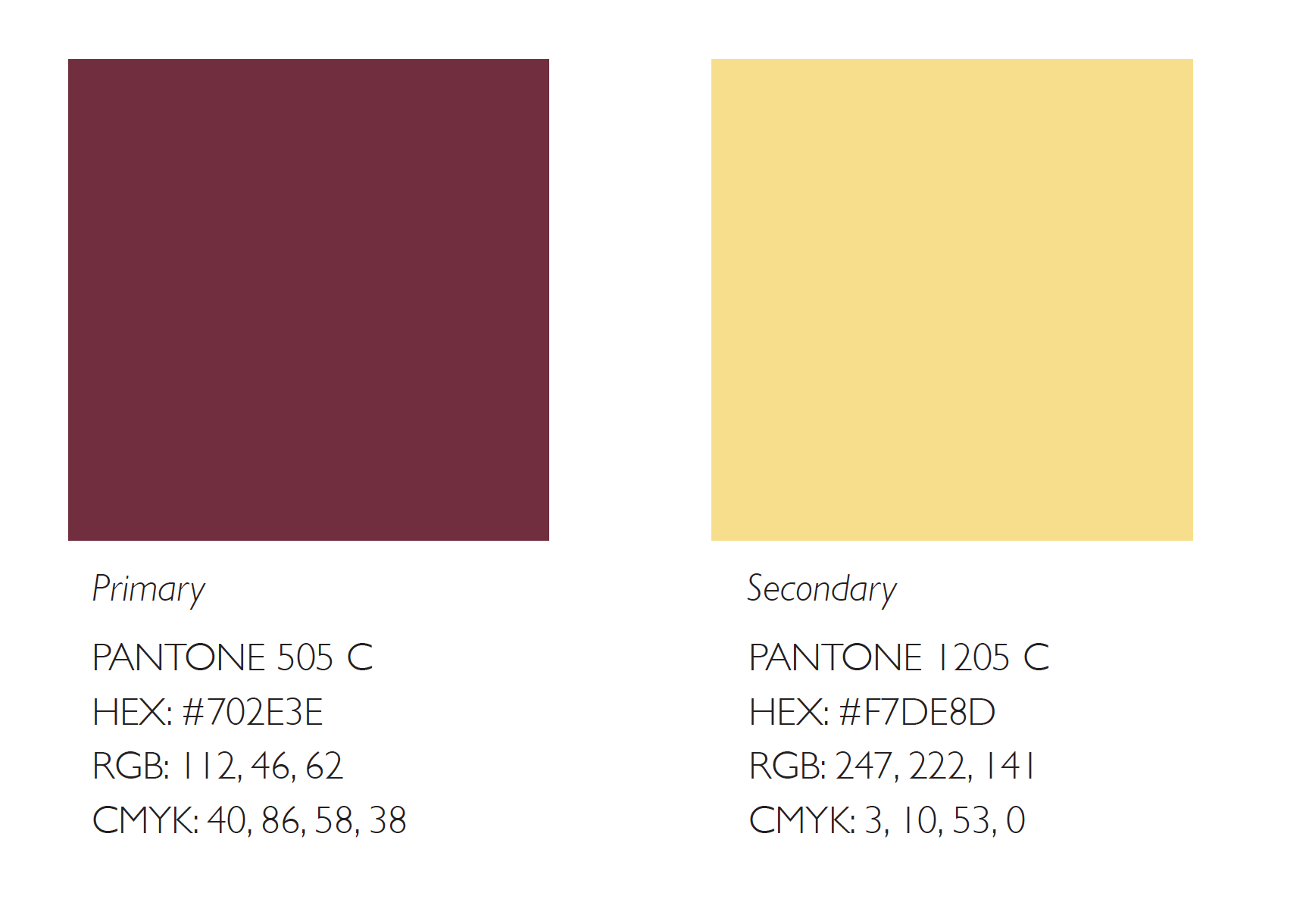
Color
Purple induces both the calming aspects of blue and the energy that red brings. It’s a symbol of peace, wellness and wisdom. Yellow is most often associated with the sun and is a representation of optimism, joy and happiness; All attributes of a healthy mental state. Making the yellow a little less saturated also alludes to a more natural experience.
Packaging
The packaging approach is reflective of the trendy health supplement brands. Much like the product itself, the packaging is meant to be familiar and approachable. It would not seem out of place on a shelf in someone’s home alongside other vitamins and supplements.
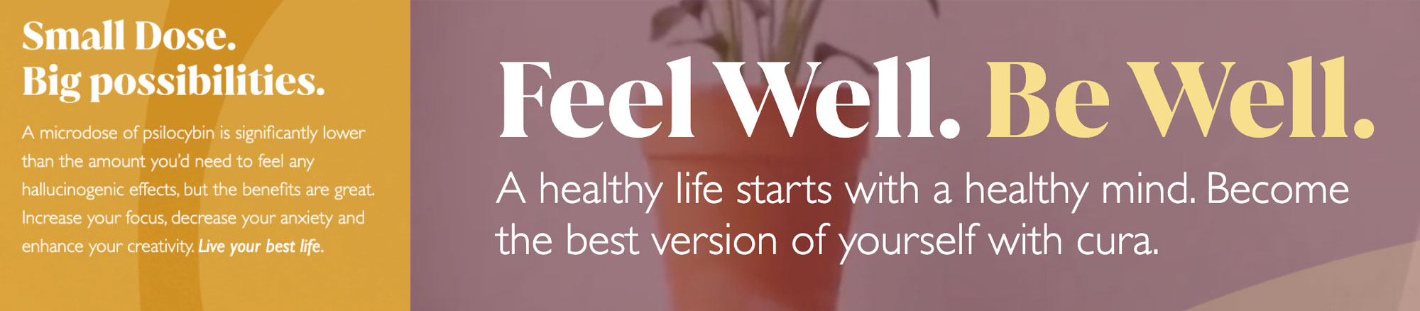
Voice + Tone
The brand voice is conversational and familiar. It fits right in hanging out with the millennial age target audience and reflects their lifestyle. Much like the target audience it’s educated and clever using familiar saying authentically like “Live Your Best Life”. There is a pronounced focus on health and self-improvement.
Now that you’ve seen the process, get a look at the goods in the portfolio.